ShopDreamUp AI ArtDreamUp
Deviation Actions


Suggested Deviants


Suggested Collections


You Might Like…


Featured in Groups


Description
Details
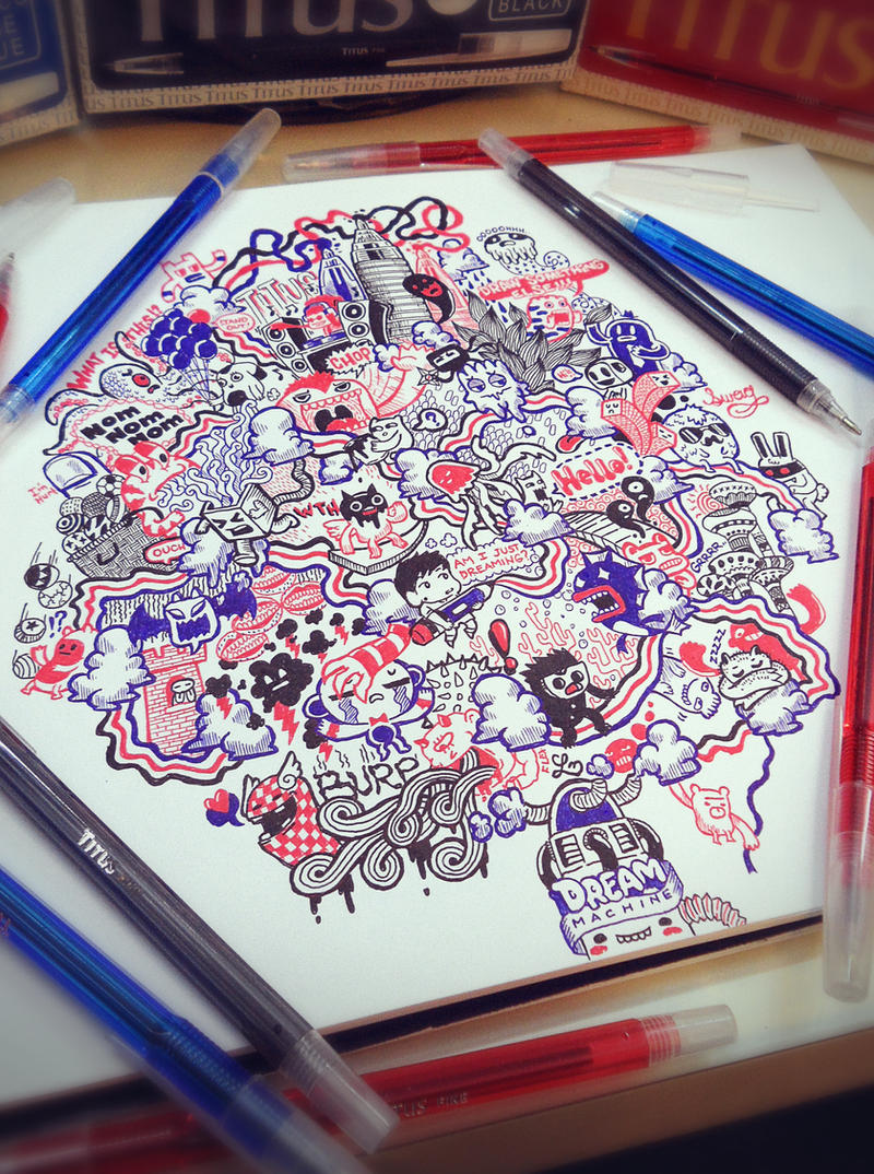
This was a project for TITUS PENS [link]
for their weekly feature of artist who could use their pens
to create amazing artworks. Check out their page!
The features gallery included famous artist from the
Philippines and the artworks were, well you tell me. (Wink)")
To check out the posted feature artwork which is typically
the clean scanned version, click this link -> [link]
Meaning
The title "BRB Dreaming" meant two things, one is that
"BRB" stands for black, red and blue which is the pattern i
used for the lines. This is to portray dreaming and seeing
only 3 colors (which is pretty awesome if it would actually
happen to me)
The other is the literal meaning which means, be right back,
i'm dreaming. When I draw my works, I get this feeling of
being sucked into my drawings and experiencing it first
hand. That's how i see the complicated flow of lines and
elements i put into it.
The Experience
Honestly, my experience of using ballpoint pens was
terrible. Aside from the limit in thickness wherein you'll have
to draw several lines to create a thick one, strokes wasn't
smooth and i encountered lots of misplaced lines. Due to my
tight schedule, i had to finish this doodle in two days and
i've gotta say, worst experience on doodling yet. The feeling
was like doodling 3 artworks all at the same time without
rests and my hands hurt like they're going to bleed anytime.
(that's why i placed a thumb on the left side that says "i'm
hurt) mr thumb felt like a rock the next day, i could barely
use it. haha
But i gotta make it clear that the Titus pens weren't the
problem at all, in-fact, if I could rate these pens, I'd put it on
my top three ballpoint pens. The problem really was in the
shortage of time to finish the whole artwork.
Still, this was an experience i'll never forget since the final
artwork was really satisfying, (Smile)")
This was a project for TITUS PENS [link]
for their weekly feature of artist who could use their pens
to create amazing artworks. Check out their page!
The features gallery included famous artist from the
Philippines and the artworks were, well you tell me.
To check out the posted feature artwork which is typically
the clean scanned version, click this link -> [link]
Meaning
The title "BRB Dreaming" meant two things, one is that
"BRB" stands for black, red and blue which is the pattern i
used for the lines. This is to portray dreaming and seeing
only 3 colors (which is pretty awesome if it would actually
happen to me)
The other is the literal meaning which means, be right back,
i'm dreaming. When I draw my works, I get this feeling of
being sucked into my drawings and experiencing it first
hand. That's how i see the complicated flow of lines and
elements i put into it.
The Experience
Honestly, my experience of using ballpoint pens was
terrible. Aside from the limit in thickness wherein you'll have
to draw several lines to create a thick one, strokes wasn't
smooth and i encountered lots of misplaced lines. Due to my
tight schedule, i had to finish this doodle in two days and
i've gotta say, worst experience on doodling yet. The feeling
was like doodling 3 artworks all at the same time without
rests and my hands hurt like they're going to bleed anytime.
(that's why i placed a thumb on the left side that says "i'm
hurt) mr thumb felt like a rock the next day, i could barely
use it. haha
But i gotta make it clear that the Titus pens weren't the
problem at all, in-fact, if I could rate these pens, I'd put it on
my top three ballpoint pens. The problem really was in the
shortage of time to finish the whole artwork.
Still, this was an experience i'll never forget since the final
artwork was really satisfying,
Image size
2432x3264px 6.96 MB
Make
SAMSUNG
Model
VLUU ST600, ST600
Shutter Speed
1/27 second
Aperture
F/3.5
Focal Length
5 mm
ISO Speed
200
Date Taken
Jun 27, 2012, 10:30:11 AM
© 2012 - 2024 LeiMelendres
Comments58
Join the community to add your comment. Already a deviant? Log In
ACTIVITY! This composition features a variety of different characters doing a number of different activities, making it a busy piece that draws your eye and keeps it to unravel and analyse, discover and imagine! The use of three colours pulls the composition together, making it chaotic but central, in keeping that unity of design, you have avoided the common mistake of randomness which leads to dissonance, the death of many a good idea. The different textures in this work should also be commented on, for the flowing lines create a path for your eye to follow, while the spikes and checkers among other graphics make it not completely uniform and break up the sameness.